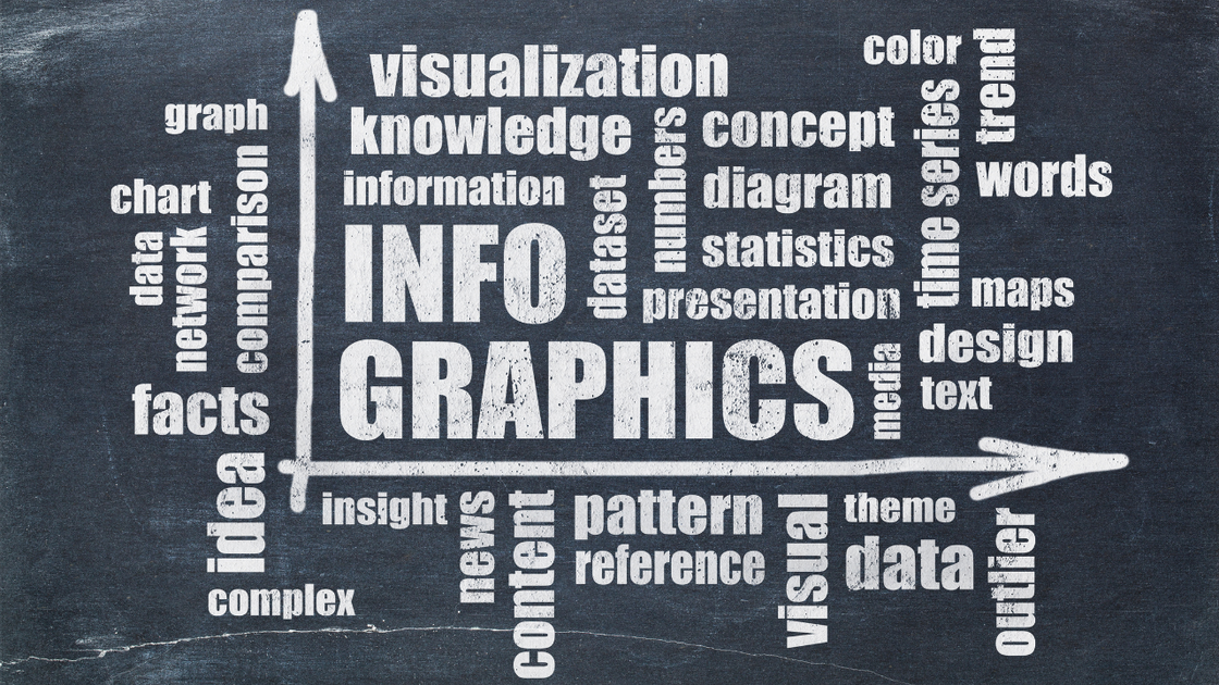
Once upon a time, health researchers interested in knowledge translation tried to “spread the word” about their findings. Now, we spread visuals, especially those compilations of visuals and text we call infographics.
Thanks to advances in technology, you no longer have to be a graphic designer to create an infographic. Tools such as PowerPoint and Canva can turn out attractive, professional-grade products.
However, you do have to bring a designer's eye to the task of creating an infographic. That means not simply catching the eye of your Impact Audience but also creating a visual story that engages and persuades them.
Two misperceptions to avoid
Three different approaches to building an infographic
There's no "right" way to create an infographic, but here are three possible starting points.
When you're clear on the message you want to convey, start by brainstorming headlines. Aim to come up with at least 10 different options; it can take several false starts to find a strong heading.
Once you've decided on your headline, then create headings for each section of your infographic. The result will be a rough outline that you can populate with visuals and explanatory text.
When you have an abundance of charts and tables, start by identifying the most important data visualization. Use that as the core of your infographic and build out from there. Consider such questions as these:
- What can you do to simplify the data visualization and make it suitable for an infographic?
- Will you feature the data visualization as a single graphic or break it up into multiple, smaller graphics?
- What other charts and tables will you use to explain or develop the message of your central graphic?
When you have a compelling story to tell, map that out visually into sections. Consider how you'll create an obvious visual path to guide the audience through the story. Here are some other questions to think about:
- What problem lies behind the story?
- Who is the hero of the story?
- Whom does the story impact?
- What are the key events in the narrative? (It may help to think of key discoveries or results.)
- What potential has been unlocked? What "happy ending" could now be possible?
Whatever your creative process, make sure you take a critical step back from your finished infographic so you can assess and refine it. The Infographic Dashboard can help with that.
Video tours of three exemplary health research infographics
Download the Infographic Dashboard so you can follow along with the videos below.
Introduction
Infographic for mental health education
Infographic summarizing an academic article
Infographic from the CDC
Curated resources
- The Secret Language of Maps: How to Tell Visual Stories with Data (book)
- Examples of visual knowledge translation projectsfrom graphic facilitator Sam Bradd of Drawing Change
- How to create an infographic (step-by-step instructions on how to build a simple infographic using Canva)
- How to create infographics with AdobeSpark (good advice regardless of which software you're using)
- Why storytelling is more trustworthy than presenting data (TedX talk)
- 20 best data visualizations of 2020 (might be some items here for your swipe file)
- The Ultimate Infographic Design Guide (from Venngage, an online graphic design app with a freemium plan)
Downloadable tools
Try this!
Using Canva or another free online tool, create a simple infographic presenting to your Impact Audience what you've learned through your health research over the past month or so. Create a story of discovery!
 Please log in or register to post a comment